Inspiring Young Readers
 posted on 25 Jun 2018
The Rime of The Ancient Mariner by Samuel Taylor Coleridge, illustrated by C. Walter Hodges
There are times when you pick up an illustrated book and you instantly know when it was first published. There’s something about the paper, the colours, the graphic style and the design values that just scream a decade – and this is one of those. You don’t have to spend too much time collecting illustrated books to spot that this is pure 1970s – in fact 1971 – and to find it in such immaculate condition is a massive bonus.
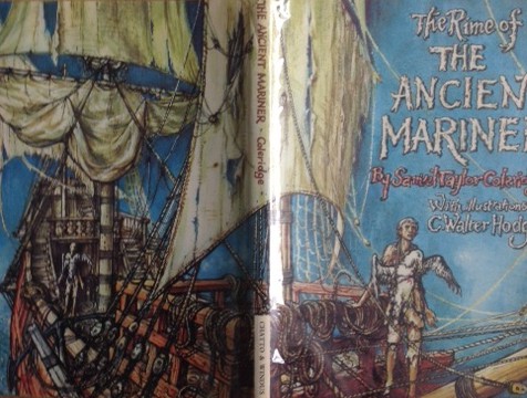
So often the dust jacket is lost or so badly damaged that the overall aesthetic is ruined. In this particular case that would be a tragedy because the jacket itself is a masterpiece covering very ordinary plain blue cloth boards underneath. The essential drama of Coleridge’s epic poem is beautifully distilled on the dramatic wrap-around and features the mariner with the dead albatross. But the star is the gothic, ghostly ship with its tattered sails.
The artist responsible for these wonderful drawings is C. Walter Hodges, a freelance illustrator who did work for some of the great children’s books of the mid-twentieth century. Hodges trained at Dulwich and Goldsmiths in the Twenties and Thirties and was commissioned to provide illustrations for a range of publishers and, in my opinion, did some of his best work for Oxford University Press.
Hodges’ real love was the theatre and he was an innovative creator of Shakespearean scene sets and he earned a reputation as an expert in the Elizabethan theatre. He split his time between his work for the theatre and his role as an illustrator of children’s classics and where he could combine the two together he did. Writing his obituary in The Independent , Nicholas Tucker noted:
“In 1964 he won the Kate Greenaway Medal for his Shakespeare's Theatre (1964), a sumptuous book building on what had already become a consuming interest, first evident in his groundbreaking work of speculative scholarship The Globe Restored (1953).”
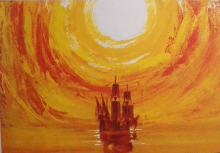
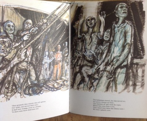
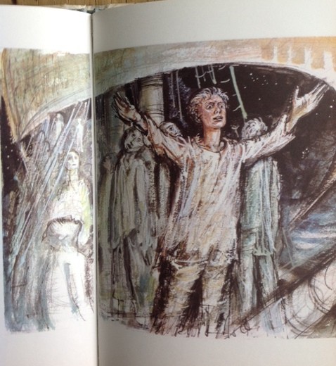
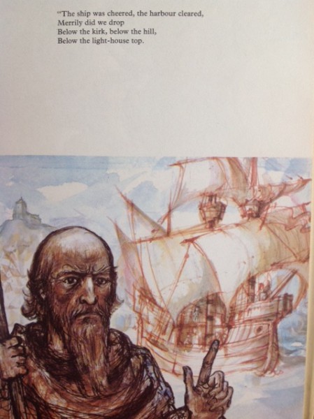
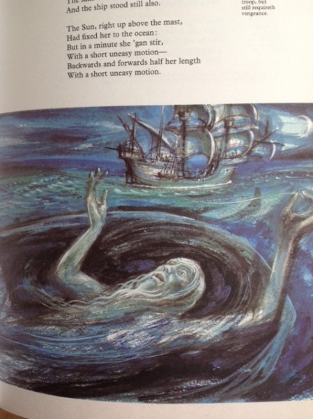
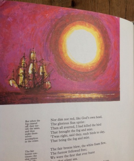
If you’re reading this article I suspect that you don’t need me to tell you the story or themes of Coleridge’s classic poem of the cursed sailor and his slaying of the pious bird of good omen, so I will focus on Hodges’ superb illustrations. In many ways the initial drawings are unremarkable and have something of the air of school readers about them but page by page the power and daring of the artwork builds to a level that matches the outstanding dust jacket for impact.
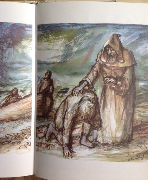
What is really superb is the way Hodges slowly begins to deconstruct his drawings as the tale unfolds, cleverly matching the disintegrating mind of the mariner himself as he’s adrift on the briny waste. So we start off with some quite stolid, realistic drawings on the early pages, drift into an almost ethereal, ghostly world and eventually find our way back onto solid ground.
I have no idea how big these illustrations were when they were originally drawn but they would work beautifully on the big scale. Yellows, ochre, blue washes and shades of orange give the pictures that 70s tint that is so immediately recognisable.
This is a real gem of book that I just love both for its intrinsic appeal and because it captures a time in illustrative history. Hodges’ work is most often associated with books for children and young adults but I think that’s often a mistaken categorisation. This will, of course, appeal to young adults but it will also delight older readers like me who love to see classic literature sympathetically and intelligently illustrated.
It’s hard to believe that these 70s classics are now the best part of 50 years old – buy them now if you see anything like this because it won’t be long before they’re as rare as hen’s teeth.
Terry Potter
June 2018
( click on any image below to view the pictures in a slide show format)
