Inspiring Older Readers
 posted on 04 Feb 2019
Classic Covers: Festival At Fairbridge by J.B. Priestley
If the job of a dust jacket is to capture and represent the spirit of the book it has been designed for and to catch the attention of potential readers, the artwork for J.B. Priestley’s Festival At Fairbridge is an absolute stand-out example.
Published by Heinemann in 1951, this is the work of the hugely talented Eric Fraser. Even if you’re very interested in 20th century art and artists, there’s a good chance you might not have heard of him; this relative anonymity may be down, I suspect, to the fact that he worked primarily in what is often called the ‘commercial art’ world. His work for advertising, periodicals, magazines and book jackets was always in demand and he developed what Martin Salisbury in his reference work, The Illustrated Dust Jacket 1920 - 1970, has called his ‘extraordinary, slightly peculiar and sometimes dark vision’.
He was born in 1902 and was taught illustration at Goldsmith’s College and over the sixty years of his career he was influenced by a range of new art movements as they came along. Salisbury also notes that despite the fact that Fraser was always adapting his style, he was never really considered ‘fashionable’ – something which didn’t seem to have much of an impact on his longevity as a sought-after illustrator and he continued working until late in his life. He died in 1983 at the age of 81.
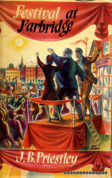
Significantly enough when it comes to appreciating this dust jacket, it's worth noting that Fraser was also very interested in painting murals and the aesthetics of stained glass – and I think that these interests are immediately obvious to see here. Priestley’s novel, which is a pretty big old slab of good natured 1950s proletarian humour, was published to coincide with the post-war uplift of The Festival of Britain and that spirit seeps through every vignette of Fraser’s artwork.
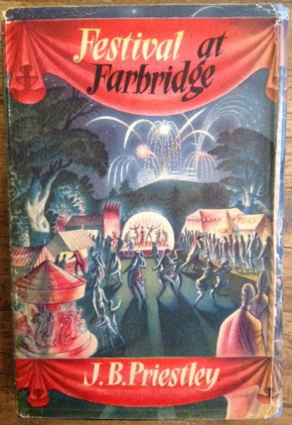
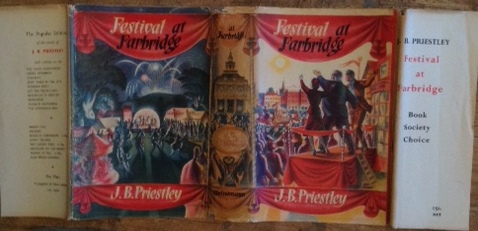
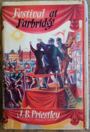
Fraser gives us a privileged perspective, a slightly raised viewing platform overlooking a huge celebratory parade, that is essentially theatrical. It’s as if we’re looking at a stage set, framed by velvet swags and curtains. The title of the book and its author’s name, hand-lettered, are contained on the curtain swags leaving our panoramic view of the parade unhindered. Cleverly, the illustration is also able to integrate the passage of time within the parade as the front shows us the daytime celebrations and, as it snakes around the spine and on to the back of the book, we switch to night-time and a spectacular firework display.
In the foreground of the front cover our focus is on the backs of three people on a raised podium looking out at the passing marching band and the assembled, excited crowd. They raise their arms in salutation and the message is clear - an unmistakable greeting of an exciting new future. Consciously or unconsciously, this is a very British and unthreatening echo of the sort of rally we’d seen in a more sinister form in Germany in the 1930s and which the nation had fought to banish. This, the artwork seems to say, is what health and constructive public celebration should look like.
Fraser’s use of colour is also central to its impact and this is where the artist’s interest in stained glass clearly comes into play. There’s a sort of hyper-realism about the use of colour – this is a world where everything is burnished and textured by a burning sunshine or bright shining interior lighting.
I love this jacket considerably more than I enjoyed the book – which in truth I have never finished despite starting it at least twice. Normally not being able to make any headway with the book might be a reason to consign it to a local charity shop – but that’s not going to happen. And it’s not going to happen because of this fabulous cover.
Terry Potter
February 2019
(Click on any image below to view them in a slide show format)


