Inspiring Older Readers
 posted on 14 Nov 2018
Classic Covers: Denis Piper’s artwork for George Orwell’s novels
At the end of the 1950s and into the early 1960s, Secker and Warburg printed a new edition of George Orwell’s novels and commissioned the artist, Denis Piper to produce the dust jackets.
I have to admit that I know virtually nothing about Denis Piper other than the fact that he was born in 1928, died in 1987 and was a book cover illustrator much used by Penguin books as well as doing this work for Secker.
Quite why any biographical information is so hard to come by I’ve no idea and it’s a bit of a surprise really because the covers he produced for the Orwell commission are genuinely wonderful. So far I’ve managed to accumulate four of the titles but the big ones – Animal Farm and 1984 – are extraordinarily elusive.
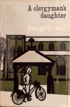
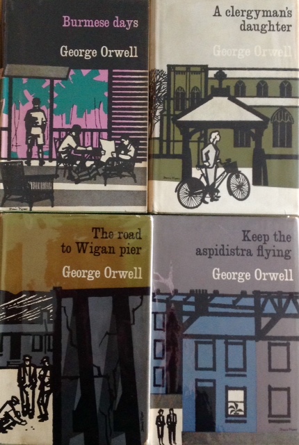
Piper’s take on A Clergyman’s Daughter makes use of rectangles and oblongs defined by thick black lines. The buildings look as if they have been constructed of children’s wooden blocks while the spidery trees that slip off the front cover and onto the spine are webs of branches with no delineation of foliage. What we’re seeing is the lychgate of a church and standing in front of it is a young woman – with no facial features but representative of the main character, Dorothy Hare – wheeling a bicycle. The colours used are black, white and olive green.
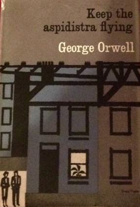
Keep The Aspidistra Flying uses the same block colour and thick black lines to create a building that dominates the cover – this time the colours are black, white, olive green and a shade of blue that runs as a strip down the centre of the illustration. One stylised window appears to be lit on the building’s ground floor and we see an aspidistra plant in outline. In the bottom left, in a square of white light are the small figures of a man and a woman.
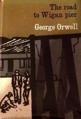
Maintaining the same colour palette and use of block colours, The Road To Wigan Pier shows three men in flat caps playing a game of some sort or maybe gambling with dice. The houses in the back are small and squat and a line of laundry flutters. But dominating at the right hand side of the jacket is a ruined wall seemingly being kept upright with wooden props.
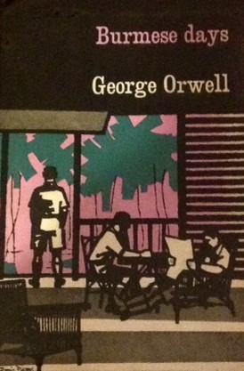
My current favourite, however, is Burmese Days which adds more colour, pink and vegetation green and presents a more complex composition. Two men sit in bamboo furniture reading newspapers and taking a drink as a third man in cotton shorts and shirt stands with his back to us, gazing out into the jungle. An empty chair features in the foreground, a railing runs around a veranda and the walls are slatted.
Piper uses a largely lower case font for the titles on the fronts of the jackets and on the spines and when the books are stacked together, the name of George Orwell lines up, as do the book titles.
Of all the later reprints that the Orwell novels have gone through over time I think these Denis Piper ones are by some distance my favourites – and I’d really love to know more about the artist. If you read this and you can point me towards more biographical information about Piper, I’d be very grateful.
Terry Potter
November 2018
(Click on any image below to view them in a slide show format)