Inspiring Older Readers
 posted on 21 Oct 2018
Herman Melville’s Moby Dick illustrated by Rockwell Kent
The three volume first American edition of Melville’s Moby Dick that was illustrated by Rockwell Kent in 1930 has become almost totemic in the world of the illustrated book. Just about everything I've read about this publication underscores the view that Kent’s drawings in some way revivified interest in Melville’s novel and promoted it to ‘classic’ status. I also don’t think it’s going too far to say that even if he'd done nothing else this book alone would have guaranteed Rockwell Kent a place in book illustration history.
The lavish production that characterised the US first edition wasn’t however replicated for the UK first edition – also 1930 – that was released by Cassell but printed in the US. A single volume edition, it’s a tight, rather squat brick of a book and, I have to say, slightly uninspiring to look at without its jacket – which is quite often missing. The copy I feature here is the one I picked up a little while ago and although it is a first UK edition it lacks that vital dust jacket.
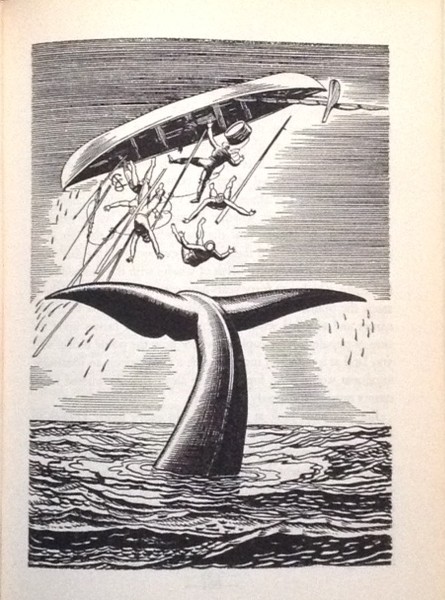
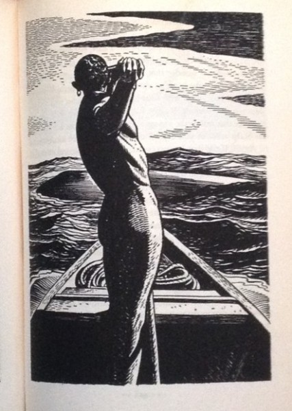
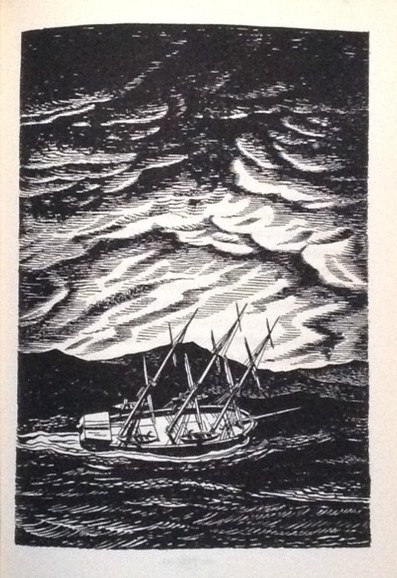
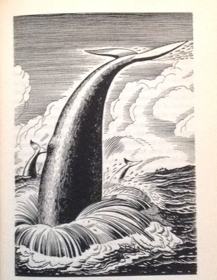
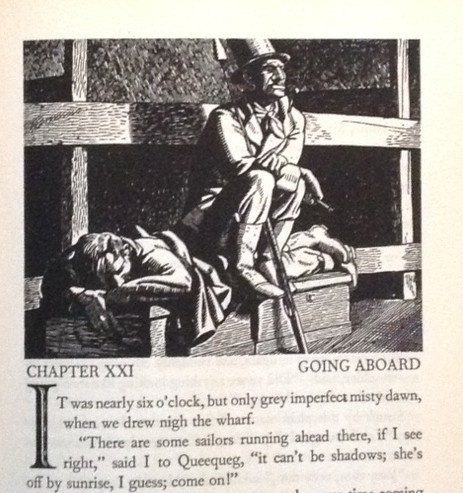
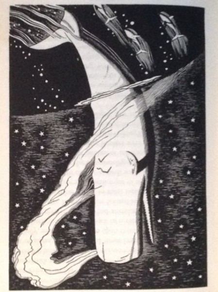
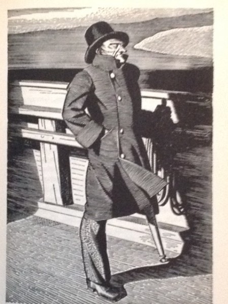
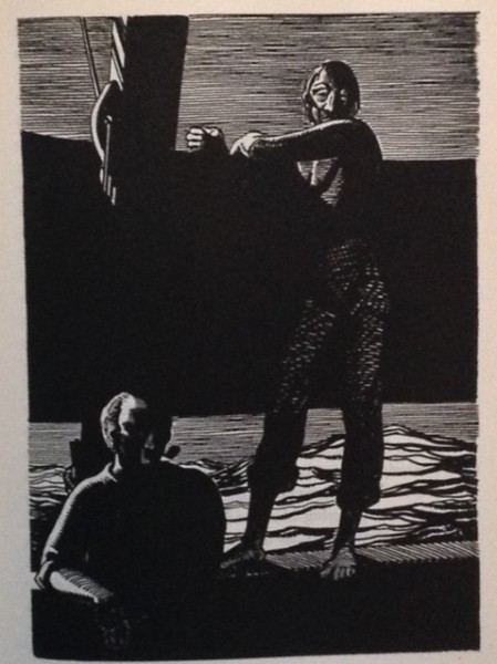
However, overcome the minor disappointment of the outside cloth and open it up because it simply tumbles with the characteristic Rockwell Kent black and white prints – some which are headers to pages, some half pages and some taking up the full page. It’s an absolute feast of illustration.
Kent (1882 – 1971 ) was a really interesting individual – a Socialist and radical all his life, he was briefly a member of the Industrial Workers of the World (IWW) or Wobblies’. He was an advocate of nuclear disarmament and lobbied for friendly relations with the Soviet Union – not causes that were universally popular in the USA! Despite these outspoken political beliefs, Kent has remained an admired figure of the American art scene. As Wikipedia notes:
"The New York Times described him as "... a thoughtful, troublesome, profoundly independent, odd and kind man who made an imperishable contribution to the art of bookmaking in the United States."
His career as an artist was unconventional and his output astonishingly diverse. The National Gallery of Art sums up his early career in this way:
“… Kent lived a peripatetic lifestyle, settling in several locations in Connecticut, Maine, and New York. During this time he took a number of extended voyages to remote, often ice-filled, corners of the globe, including Newfoundland, Alaska, Tierra del Fuego, and Greenland, to which he made three separate trips. For Kent, exploration and artistic production were twinned endeavors, and his travels to these rugged, rural locales provided inspiration for both his visual art and his writings. He developed a stark, realist landscape style in his paintings and drawings that revealed both nature’s harshness and its sublimity. Kent’s human figures, which appear sparingly in his work, often signify mythic themes, such as heroism, loneliness, and individualism……Around 1920 Kent took up wood engraving and quickly established himself as one of the preeminent graphic artists of his time. His striking illustrations for two editions of Herman Melville’s Moby Dick—simultaneously precise and abstract images that drew on his architect’s eye for spatial relations and his years of maritime adventures—proved extremely popular and remain some of his best-known works. Throughout the 1920s and 1930s, Kent produced a range of print media, including advertisements, bookplates, and Christmas cards. Kent’s satirical drawings, created under the pseudonym “Hogarth Jr.,” were published in popular periodicals including Vanity Fair, Harper’s Weekly, and Life. In 1937 the artist was commissioned by the Federal Public Works Administration to paint two murals for the New Post Office in Washington, DC.”
Kent’s decision to work in solid black and white for his Moby Dick proved to be an inspired decision – the drawings help to create the atmosphere of severe, almost stark darkness that reflects the mood of the book and the harsh environment of the quest. There is an immediacy jn the ‘truth’ of the illustrations that speaks directly to the reader – a fact that is handsomely underscored by the way that the initial three volume print sold out it’s 1000 copies almost immediately. Not too shabby in the middle of the Great Depression.
Writing to his publisher’s Director of Design and Typography, William A. Kittredge, Kent said that he considered Moby Dick ‘a most solemn, mystic work,’ and that the ‘whole book is a work that should be read slowly, reflectively; the large page and type induce such reading. The character of the type should be homely, rather than refined and elegant, for homeliness flavors every line that Melville wrote.’
Despite the fact that the UK edition is a less spectacular production than the US first, it’s still a joy and I was absolutely delighted to pick up my copy (minus jacket) in good, sound order for less than £50. A lot of money, I know, but a modest sum for a great classic of literature, illustration and printing.
Terry Potter
October 2018
(Click on any image below to view the illustrations in a slide show format)
