Inspiring Young Readers
 posted on 06 Nov 2016
John Burningham
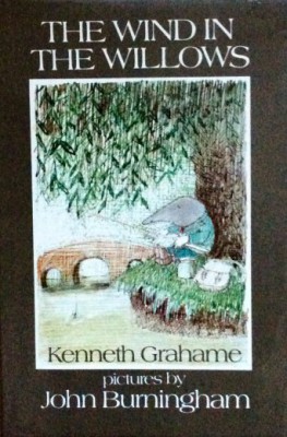
This prolific illustrator has been around in book illustration for a very long time and is still producing beautiful books, usually aimed at children. He was born in 1936 and had a rural childhood mostly living an unconventional but very happy life in a caravan near Gloucester where his father worked as a gardener and handyman at a local school. As a young boy he attended several different schools eventually becoming a boarder at Summerhill, A.S. Neill’s progressive and unconventional school where he was encouraged to spend lots of time doing what he most enjoyed, drawing and painting. He went on to study at the Central School of Art and Design in London where he met his wife, Helen Oxenbury who is also a well- loved illustrator of children’s books.
His first successful picture book was Borka (1963) which received the much sought-after Kate Greenaway Medal. What characterised this one and all others after it, was innovative and masterly design plus an original and eccentric take on the world. Brian Alderson explains that his matter of fact pictorial depictions are made even more authentic by his unpatronising and simple text which help to make his books so memorable.
Before his success as a picture book author and illustrator he designed posters for London Transport and the Royal Blue coach company which Alderson aptly describes as ‘static feasts for the eye’ . His experience in this work is evident in many of the landscapes and other settings that appear in the books, most notably in his gorgeous book about the seasons which included four fold-out posters in the original publication. I can remember using these in my classroom in the early 1980s because they so perfectly captured changes in the natural world, as well as being beautiful to look at.
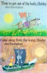
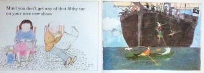
It is difficult to decide which books to reflect on here as they all deserve attention but I think that the two books about Shirley are probably my favourites, and very typical of his style. It is the juxtaposition between dense colour on the right hand side of the page and more white space and paler colours on the left hand side that shows us how differently adults and children experience the world. In ‘Come away from the water Shirley', her dull conventional parents are faffing about with deckchairs on the beach whilst she is off in a boat dealing with pirates. These are two parallel narratives but the message is that the child’s imaginative world view wins every time.
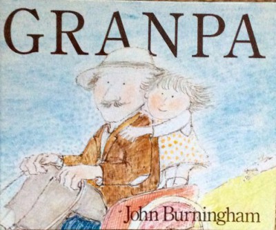
His book about the tender relationship between a child and her grandparent is even more sophisticated using soft colours throughout but hints at the past through simple line drawings on each left hand page. He also uses the fonts very creatively to convey the two different voices making this one of the most ingenious and well- structured picture books ever produced – he based the text on fragments of conversation overheard between his own daughter and her grandfather which gives a beautiful poetic texture. His use of white space balanced with some double page fully coloured spreads manages to take the reader right to the heart of these fond memories.
He enjoys uses a wide range of different media including crayon, ink, collage and photographs and clearly enjoys experimenting. His drawings are often deceptively simple but the final results are the result of ‘masses of preparatory drawing’. In an interview published in a book which documented a wonderful exhibition of contemporary children’s book illustration a The British Library in 2003 he explained that:
‘Drawing is like playing the piano, it’s not a mechanical skill like bricklaying, and you have to practise constantly to keep it fluent’.
Burningham is generally regarded as one of those artists responsible for the picture book design revolution that happened in the early 1960s. This included other greats like Maurice Sendak, Brian Wildsmith and Charles Keeping and happened as a glorious blend of burgeoning unconformity alongside ground breaking graphic developments that allowed new techniques with colour processes. There was also the growth of an international market which ensured longer print runs for popular books. In an affectionately written foreword to the splendid ‘must have’ autobiographical book John Burningham, published in 2009 Sendak writes:
‘Down with the simpering 19th century goody- goody books that deprived children of their animal nature, wild imagination and lust for living… The swaddled and straightjacketed 19th century world of children’s books were set free and we were off and running’.
He is still producing wonderfully distinctive picture books which have an increasingly old fashioned atmosphere. He has always been a personal favourite of mine but I know that many people find his style too subtle and quiet. Having introduced his books to students over the years I realise that he is an illustrator that needs close looking because he doesn’t shout at the reader in the same way as do many illustrators. Once time is taken, then they would often realise the quality of his detailed drawing and the ways in which he uses line, space and colour to superb storytelling effect. One of his illustrator contemporaries, Raymond Briggs writes:
Burningham is a blooming nuisance. He should retire now. After all he is very old. But, no doubt he will go on and on, doing yet more brilliant stuff’.
I do hope so …
Karen Argent
November 2016