Inspiring Older Readers
 posted on 02 Jul 2018
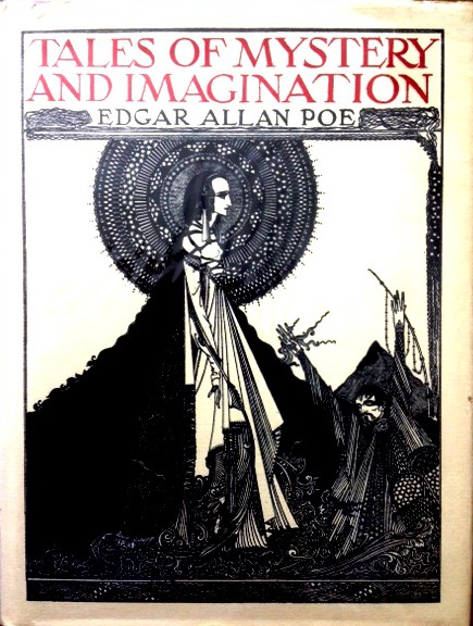
Tales of Mystery and Imagination by Edgar Allan Poe illustrated by Harry Clarke
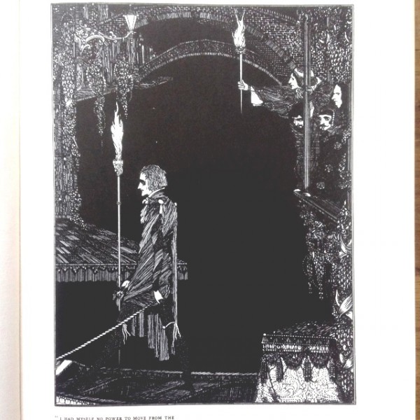
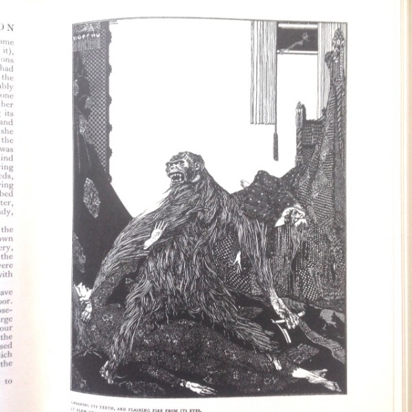
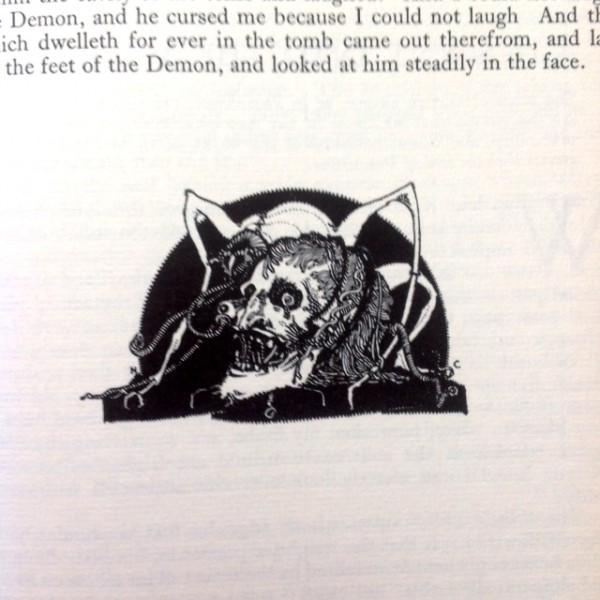
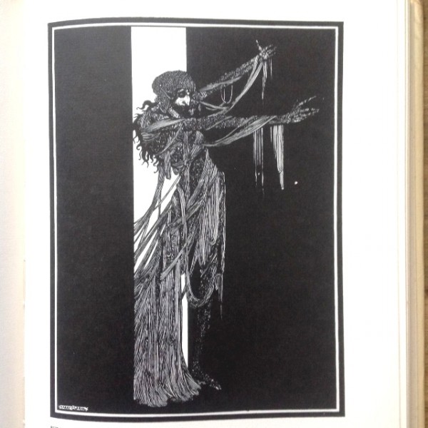
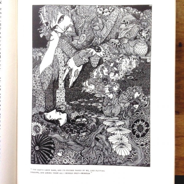
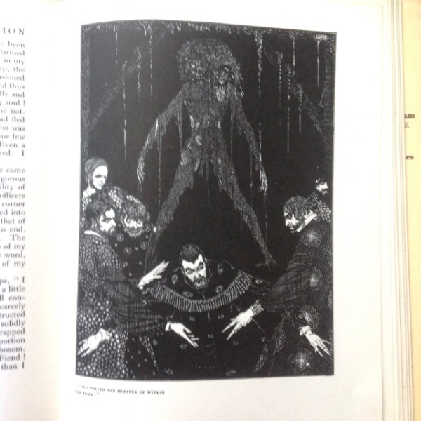
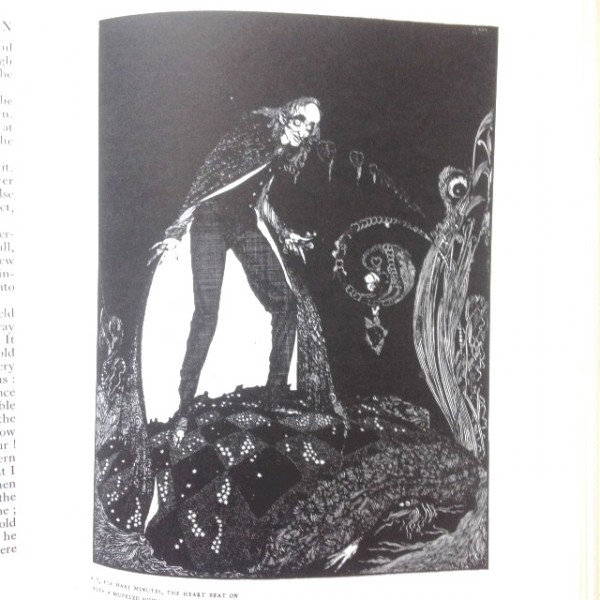
It’s almost impossible to imagine how any artist could accept a commission to illustrate the works of Edgar Allen Poe and not be influenced by the heady mix of the gothic and art nouveau produced in 1919 by the Irish artist, Henry Patrick (Harry) Clarke.
Clarke started life as a stained glass maker in Dublin working in the studio of his father and, at the same time, he studied at the Metropolitan College of Art and Design, where he also met his wife, Margaret Crilley, also an artist and art teacher. They moved to London so that Clarke could try his hand at earning a living as a book illustrator and his first published work was a collection of Hans Andersen tales released in 1916.
His version of Poe’s Tales of Mystery and Imagination came along in 1919 and was originally published with a series of black and white (halftone) illustrations. This was successful enough to merit an upgrade in 1923 to include a number of colour plates. This was the version that really made Clarke’s name and built his popularity – he went on to have success with several other classic texts before he died in 1931 at the age of just 42. Like so many impecunious artists in the first half of the 20th century, he died of TB after a lifetime of problems with chest infections.
The copy showcased here is the 1971 Minerva Press reprint of the original 1919 version – so without the colour plates. I’m personally quite pleased that it only features the original halftone illustrations because they feel more faithful to Clarke’s original vision and to his influences. It is, of course, immediately obvious that Clarke was a disciple of Aubrey Beardsley – the mix of flowing, sinuous lines and the suggestion of the decadently evil is a powerful and heady concoction. Maria Popova, writing on the Brain Pickings website describes Clarke’s work on the Poe collection in this way:
"Eerie and erotic, Clarke’s illustrations bring his Edwardian-era aesthetic and early Art Nouveau influences to the post-Victorian liberated fascination with sensuality."
I can’t pretend that this Minerva edition is anything like as beautiful and tactile as the original – the paper is a bit too chunky for my taste and the reproduction of the plates nothing like as sharp as they could be – but it’s what I could afford. That’s not to say it’s poor – the top page block is gilded and gold impressed red cloth hard cover underneath the very average jacket is actually quite impressive.
But hold your breath because I think you’ll be amazed at the prices you’ll have to pay to get hold of a copy. If you want a 1919 original you’ll need deep pockets because you’ll have to stump up over £300. Even for the Minerva reprint you should expect to pay around £45. Cheaper and later reprints are available but the quality isn’t something I have personally examined and so I couldn’t in all honesty comment on them. All I can do is advise you to check them out before you buy.
Terry Potter
July 2018
(Click any image below to view them in a slide show format)