Inspiring Older Readers
 posted on 09 May 2018
Hamlet, Prince of Denmark by William Shakespeare, published by City of Birmingham School of Printing
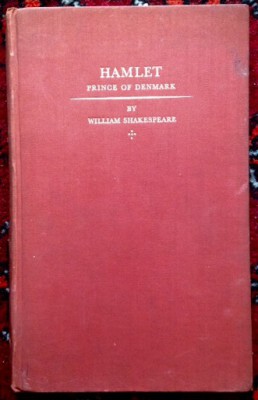
At first sight the book I have in front of me as I type this article looks unremarkable. An ox-blood coloured, cloth-bound edition of Shakespeare’s Hamlet that is rather scuffed and soiled, missing its dust jacket and showing its 78 years. The title of the book and its author are embossed on the front in gold and there is a modest cruciform adornment just below the author’s name.
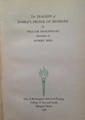
However, open it up to the title page and things start to get more interesting. It tells us not only that the book is illustrated by Robert Bird but that it was published in 1940 by the City of Birmingham School of Printing, College of Arts and Crafts, Margaret Street. And here, of course, is what makes this book so interesting as an object because it was the product of one of the most remarkable printing schools the country has known.
The fame of the City of Birmingham School of Printing is really built on the reputation of the man who headed up the institution from 1925 – 1953, Leonard Jay. By any measure Jay was a phenomenon who, almost single-handedly, transformed the teaching of printing by insisting on a set of values that R.S. Hutchings describes in this way:
“His teaching was imbued with the conviction that nothing worth printing could be too small, too lowly, or too unimportant to be well designed, and that every single job deserved the highest possible standards of composition and press work practice.”
What is especially interesting about the books that were published during Jay’s time in Birmingham is that they were all produced, under supervision, by students of the School of Printing who were putting into practice the substance of Jay’s tuition.
In his book on Leonard Jay, author. L.W. Wallis provides a detailed bibliography of all the volumes published throughout his years at the head of the school. Intriguingly, Wallis is able to give us a complete breakdown of the whole attribution of the book design and production:
“ The Tragedy of Hamlet, Prince of Denmark by William Shakespeare.
Format: 6.25 x10.25, 144 pages
Monotype composition in 14-point Baskerville by students under instruction from T. Gill and H.Bracey.
Compositors’ work by pre-apprentice students under the direction of H.Page and F.Moseley.
Letterpress printing by students attending classes of A. Hoyle and V.S. Ganderton.
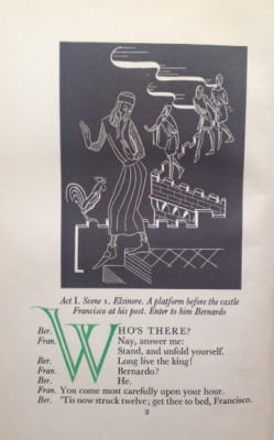
Illustrations by Robert Bird (Teacher: A.M. Fletcher)
Colours: Black and Green”
And so what does all this amount to when it comes to the book itself?
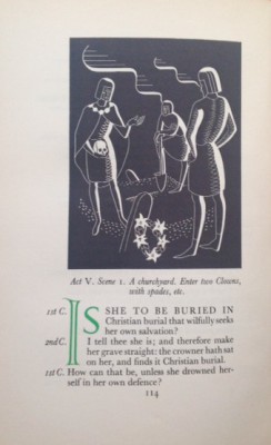
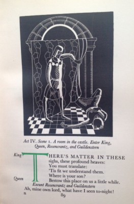
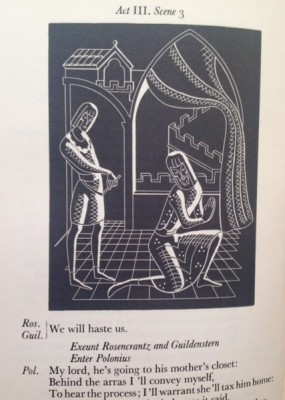
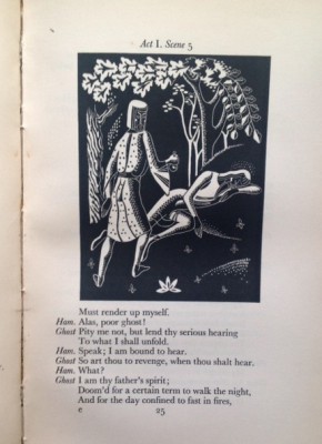
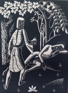
The dimensions of the book make it feel slim and elegant and the very limited use of colour on the leading letter has impact – it’s a sort of less is more thing. The illustrations are, or maybe just ape, woodblock prints and they are effective in a style that I found very reminiscent of Eric Gill and his illustrations for Shakespeare.
I love this book not just because it’s such a well-designed and fascinating artefact and not just because it’s a classic text but because it’s a little time capsule of a special moment from the past when the craft of book design was a public good and the teaching and practice of the book maker, the designer and illustrator became transparent to a wider audience.
I noticed the other day that at some point in the past a full set of the volumes produced over the years by the School of Printing went up for auction and sold for around £800 – which strikes me as an absurdly modest sum for a slice of history of that kind. But the message is, these books are out there, they’re probably not too expensive and you should buy them if you see them.
Terry Potter
May 2018
(click on any image below to view the pictures in a slide show format)