Inspiring Older Readers
 posted on 25 Jun 2019
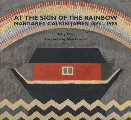
At the sign of the rainbow: Margaret Calkin James 1895-1985 by Betty Miles
At a time when the rather depressing evidence emerging from research undertaken in the literary and publishing world shows that it is still an environment in which predominantly white, middle class men retain disproportionate power and influence, I’m always delighted when tenacious scholars bring otherwise marginalised writers and artists – especially women – into the sort of prominence they deserve.
Names that would never have registered on my radar are given a showcase in publications like this one by Betty Miles on the artist and book jacket designer, Margaret Calkin James and the result, for me at least, is something of a revelation. James is not unknown to the art world cognoscenti – you’ll find plenty of information about her on a variety of websites – but to the interested lay person like myself, she was to all intents and purposes invisible until I came across this book.
Margaret Calkin (1895 - 1985), who used the name Margaret Calkin James following her marriage, attended the Central School of Arts and Crafts where she made a special study of calligraphy and gilded illumination and during the First World War she worked for the YMCA art department. When the YMCA closed its doors she took over the premises and set up the Rainbow Room Gallery, the first to be managed by a woman to promote art, craft and design.
Calkin married Charles Holloway James in 1922 and the couple were popularly known as Jane and Jimmy, which was an indication of the strength of their relationship and partnership.
V&A Archive papers describe Calkin James’ output in this way:
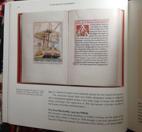
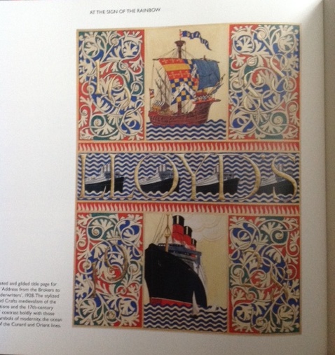
“Observational drawing and watercolours underpinned all Calkin James's designs and in 1935 she designed the first ever GPO greetings telegram form. She had three solo shows in London: at Cooling Galleries (1935); at Kensington Art Gallery (1948); and at St George's Gallery (1957).”
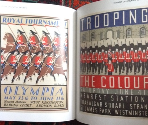
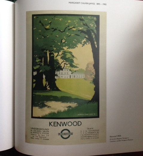
But this dramatically under-sells the variety and scope of her artwork. A profile of her on the London Transport Museum site (yes, she designed their publicity too) captures a more accurate description of her range:
“She designed lampshades, stage props, posters, pattern papers for the Curwen Press, book jackets, fabrics and the first greetings telegram for the GPO. She designed advertisements for Shell, British Broadcasting Commission and other organisations.”
Although she became quite disabled following a stroke in 1969 - it left her without speech or use of her right hand – she continued to find ways of expressing her artistic vision experimenting with how she could best make use of her left hand and much of the work done after 1969 was exhibited during the International Year of the Disabled (Welwyn, 1981; Central London YMCA, 1982).
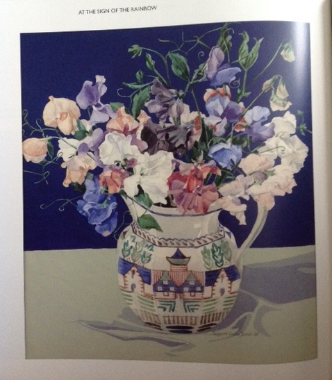
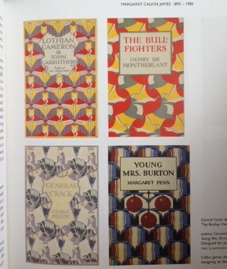
Predictably enough, I am especially drawn to her book jacket design work which Betty Miles describes as full of ‘subtle variation’ but dominated by the need for the jackets to be clear, legible and striking. In pursuit of this she would often create “hand-drawn letterforms or written scripts and flourishes to suit the individual character of each title.”
The introduction to this slim volume is written by Alan Powers ( a seasoned commentator on the power of design in both books and ephemera) who notes in his contribution :
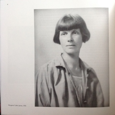
“She belonged to a period, as her bobbed hair photograph suggests, but her work is still fresh..”
And that is certainly the case. You can find out for yourself if you get your hands on a copy of this publication from Felix Scribo. It’s not likely to cost you more than £10 but it will pay you back many times over in the pleasure it gives.
Terry Potter
June 2019
Click on any image below to view them in a slide show format