Inspiring Older Readers
 posted on 19 Feb 2016
E. McKnight Kauffer : Design by Brian Webb & Peyton Skipwith

Given that you’ve found this review in the section of the website we’ve called ‘Take A Look At This Fantastic Book’, it might be timely to pose the question ‘Just what is it that makes a book a fantastic or beautiful object?’ From my point of view this usually boils down to two things – either the book’s illustrator or its designer ( I know there are those who want to cheer for book binders too – but that rather passes me by I’m afraid).
Book illustrators tend to get their fair share of kudos for their efforts but designers – those people responsible for the overall aesthetic of a book – often remain anonymous and fly under everyone’s radar. So, I was delighted to stumble over this slim volume produced by The Antique Collectors’ Club which acts as an introduction to the work of E. McKnight Kauffer.
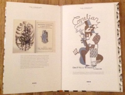
I’m prepared to bet that very few people know that name but I’m equally prepared to wager that everyone knows his work – especially his commercial posters. Kauffer (1890 – 1954) was born in the USA but spent the majority of his working life in Britain before returning to the States shortly before he died. Kauffer trained in art and design in California and Chicago before travelling to Paris and ultimately ending up in London. He was very much associated with the Modernist Movement in the inter-war years becoming involved in a range of design projects, including architectural ventures for which he provided murals.
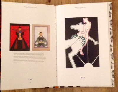
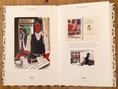
However, the work that most people will recognise was his poster art and book design. He produced over 140 posters for London Transport and London Underground and many of these have become iconic images that draw on a range of contemporary art styles. However, what most interests me was his book design. He illustrated and provided book jackets for a range of different publishing houses – The Hogarth Press, Gollancz, Putnam and The Crime Club to mention just a selection. He was also in demand for the so-called ‘private presses’ such as Nonesuch who wanted to provide limited editions with high design values. I think his illustrations for the Nonesuch edition of Don Quixote (1930) are particularly fine.
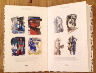
This little book will also introduce you to the wide range of interests that Kauffer had beyond book design. He was a talented stage set designer and magazine artist in addition to his book work and this is well represented here. There’s just enough information in the text to leave you satisfied without being loaded down with unnecessary detail because it’s the graphics that are the star of the show and they are rightly given most prominence.
The book I have reviewed here was published in 2007 and comes at a very modest price - you’ll get a copy for a little over £5 if you shop carefully – and you’ll find it’s money very well invested.
Terry Potter
February 2016